


Most product pages aren’t broken.
They load fast. They show the product. They include details, images, maybe even reviews. On paper, they check all the boxes.
And yet conversion remains stubbornly low. Across industries, only 1-3% of product page traffic converts into a purchase.
The instinct is usually to fix what’s upstream. Better targeting. Smarter creative. More spend. But the real issue is not getting people to the page, but what happens after they get there.
High-converting pages aren’t lucky. They are not even that much more “beautiful” than average ones. What they are is deliberate, designed around how shoppers actually make decisions.
The product page has a harder job than most teams realize
A decade ago, the PDP was basically a digital shelf label. Show the product, list the specs, maybe include a nice photo. Done.
That’s not the job anymore.
Today, the product page has to do what an entire in‑store experience used to handle. It needs to explain the product clearly. It needs to prove, through real customer evidence, that the product actually delivers. And it needs to give shoppers enough confidence to act, right then, without a store associate or a friend standing next to them saying, “yeah, that one’s great.”

Many product pages just aren’t built for these expanding roles.
Conversion doesn’t fail in one moment. It can break at any stage of the decision journey. Here’s what owners of high‑converting pages understand that others miss: purchase decisions aren’t a single moment—they’re a sequence.
Every shopper who lands on a product page is working through progression, whether they realize it or not.
- First, they’re trying to figure out if the product is even relevant — Is this right for me?
- Then, if it passes that filter, they shift into evaluation mode — Can I actually trust this?
- And finally, if they believe it’s a good fit, they face the last question — Do I feel confident enough to choose this right now?
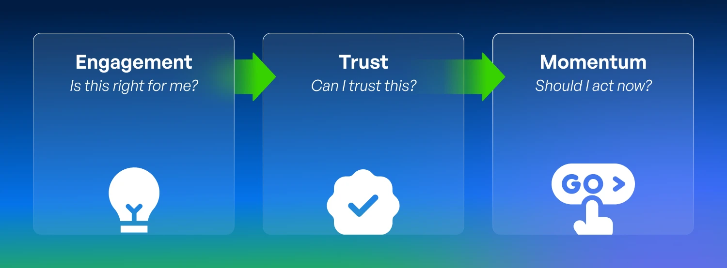
When a product page answers all three of those questions well, conversion follows. When it fumbles even one of them, the shopper hesitates.
The essential elements of a high-performing PDP
Understanding comes first, and most ecommerce and product teams underestimate what it takes to get there
The first job of a product page is deceptively simple: help the shopper understand the product.
Not “show them the product.” Not “list the features.” Actually help them understand what it does, why it matters, how it fits their life.
This sounds basic, but it’s where a huge number of pages quietly lose people. Research shows that 44% of shoppers have recently abandoned a purchase because product information was unclear or insufficient. Not because the product wasn’t a fit, but because the page didn’t make its value clear fast enough.
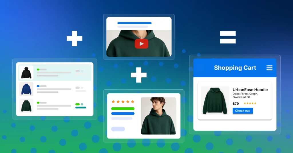
High‑converting pages solve this by making comprehension effortless. They use visuals that explain, not just decorate: comparison layouts that help shoppers self‑qualify, interactive elements that explain value without requiring the shopper to dig. The goal is to remove the cognitive work that sits between “I’m interested” and “I get it.”
Most importantly, they do this across the full catalog, not just the hero SKUs that get all the creative attention. Most of the unrealized revenue left on the table from underperforming PDPs lives in the long tail of the catalog.
Trust isn’t a widget, it’s the backbone of the evaluation stage
Once a shopper understands the product, the calculation in their head changes completely.
They stop evaluating features and start evaluating risk. Did this actually work for other people? Were there surprises? Would someone like me be happy with this?
This is where customer voice becomes the most powerful conversion signal on the page. Not brand messaging. Not polished photography. Real feedback from real buyers.
The numbers here are hard to argue with. 96% of shoppers actively seek ratings and reviews before making a purchase decision, ranking them above social media, search results, and even recommendations from friends and family. And the relationship between review coverage and conversion is steep: products with even a small number of reviews see more than 50% higher conversion, and that lift climbs to over 250% as volume grows past 100 reviews.
But here’s what separates high‑converting pages from average ones: it’s not just having reviews. It’s having enough of them, in the right places, with enough depth to actually support a decision.
Too many brands treat reviews as a checkbox: present on the page, technically functional, but not strategically managed. The best-performing pages treat customer voice as infrastructure. They invest in consistently generating reviews, syndicating them across channels so credibility doesn’t reset when shoppers switch retailers, and accelerating coverage on new or seasonal products before trust gaps suppress conversion.
The decision moment is where most digital experiences go silent
This is the part that doesn’t get enough attention.
A shopper understands the product. They’ve read the reviews. They believe it’s a good fit. And then… they hesitate.
In a physical store, this is the moment when context takes over. You see other people picking up the same item. A staff member mentions it’s been popular. The shelf tag or packaging tells you something useful. Small signals, but they matter by giving you permission to stop deliberating and just decide.
Online, that moment is almost always silent. The page looks the same whether one person is viewing it or ten thousand. There’s no equivalent of “this has been flying off the shelves.” No subtle cue that says “you’re making a good choice.”
High‑converting pages fill that gap with value reinforcement. They surface key product attributes that might otherwise be buried in a spec sheet. They highlight where a product sits within its category. They reflect real shopper behavior in ways that help the current shopper orient their decision.
These signals inform shoppers. And when they’re present at the right moment, the impact is measurable. Conversion messaging at the decision stage has been shown to drive 2–20% conversion lift across categories.
The real problem: good components, weak orchestration
If you’ve read this far, you might be thinking: we already do most of this. And you might be right, individually.
Most mature ecommerce teams have invested in better content. Many have a reviews program. Some have experimented with on‑page messaging or badges.
But here’s the pattern that keeps showing up: these elements are owned by different teams, managed in different systems, and optimized on different timelines. Content marketing builds the product story. A separate team manages reviews. Merchandising handles on‑page signals.
Each piece might be “working.” But they’re not working together.
And that’s why conversion plateaus. Not because any single element is broken, but because the journey between them is disconnected. A shopper moves from understanding to evaluation to decision, and at each handoff, a little bit of confidence leaks out.
The brands seeing the strongest results are the ones who’ve figured out how to connect the signals across the full journey, so engagement feeds trust, and trust feeds confident action.
Why this matters more right now than it ever has
Customer acquisition costs aren’t going down. Competition for attention isn’t easing up. And the way shoppers discover and evaluate products is evolving fast. As AI‑assisted search, agent‑driven recommendations, and increasingly compressed consideration sets continuously reshape the landscape.
The product page is no longer just a destination. It’s a qualifying moment. The brands that win won’t be the ones spending the most to drive traffic. They’ll be the ones converting more of the traffic they already earn.
The shift from acquisition‑first to conversion‑first is already underway. And it starts with rethinking what the product page is actually built to do.
From product pages to conversion systems
The highest‑converting product pages share a common trait: they treat conversion as a connected system, not a collection of isolated improvements.
- They design for engagement, helping shoppers understand quickly.
- They invest in trust, making credibility visible and scalable.
- And they reinforce momentum, giving shoppers the confidence to act at the moment of decision.
When those three stages are intentionally aligned, and built on a foundation of accurate, consistent product information, the entire experience performs differently.
That’s the thinking behind what we call the Syndigo Ultimate Conversion Formula: a framework for connecting engagement, trust, and momentum into one cohesive PDP strategy. It’s not about doing everything at once. It’s about understanding where confidence breaks down in your journey — and building from there with purpose-built content designed to move an ecommerce shopper down every stage from uncertainty to ‘add to cart’.
Because the future of commerce doesn’t belong to the brands with the most traffic.
It belongs to the ones that make it easiest to say “yes.”
Learn how the Ultimate Conversion Formula connects engagement, trust, and momentum to turn product pages into revenue engines.